September in Motion
Welcome to Months in Motion - a monthly newsletter where we’ll look at some of our favourite projects, industry trends, emerging technologies, as well as studio updates from us. As the name suggests, we release these monthly, so subscribe and keep your eyes peeled for a new post at the start of each month! 👀
Favourite Projects
Studio Blackburn - NOPINZ Brand Film
This month, the team at Studio Blackburn unveiled a fresh new minimalist identity for NOPINZ - a UK-based company specialising in high-performance cycling apparel, best known for its innovative aerodynamic clothing for cyclists and triathletes.
Studio Blackburn set out to create an identity based upon it’s founders' focus on pure performance.
This stripped-back identity heavily leans on typography and iconography to lead the design language. A minimalist colour palette also allows their primary brand red to really pop.
To announce the launch, Studio Blackburn created a kick-ass, energetic motion graphics film. It carries the energy and speed you’d expect from a high-performance cycling company, matched with beautiful sound design.
Make sure your speakers are on for this one!
Ravie.co - Aura Brand Film
Yep, that’s right, we’ve got another banging brand launch film featured this month.
This time, by Ravie.co for Aura. The film is a prime example of how to blend bold 2D with 3D oh so smoothly.
Aura is a spec furniture brand, aiming to bring luxury into home retail and office spaces. Ravie.co created a bold colour palette, predominantly contrasting a bright orange and dark green against one another.
The film blends kinetic type and iconography with stylish 3D assets. The use of space and block colour really makes the brand's identity jump out at you.
We also like the hints of playfulness added, such as the 3D furniture objects slightly overstepping their margins and the rainbow effect on the word ‘hue’.
And of course, it wouldn’t be such a standout brand film without equally well-crafted sound design to accompany the visuals. What more can we say? It’s *chef's kiss*.
Industry News/Trends
Slow death of flat design?
In the last 12 months, we’ve slowly seen a lot of companies (particularly tech) move away from flat design and toward a textured 3D translucent design
This is prominent in the design direction that Microsoft has taken, specifically with their branding for CoPilot by Koto.
We can see this style pushed even further by our friends at Weareseventeen with their work for Viva, using a combination of glass and plushy-type icons that look comfy enough to sit on.
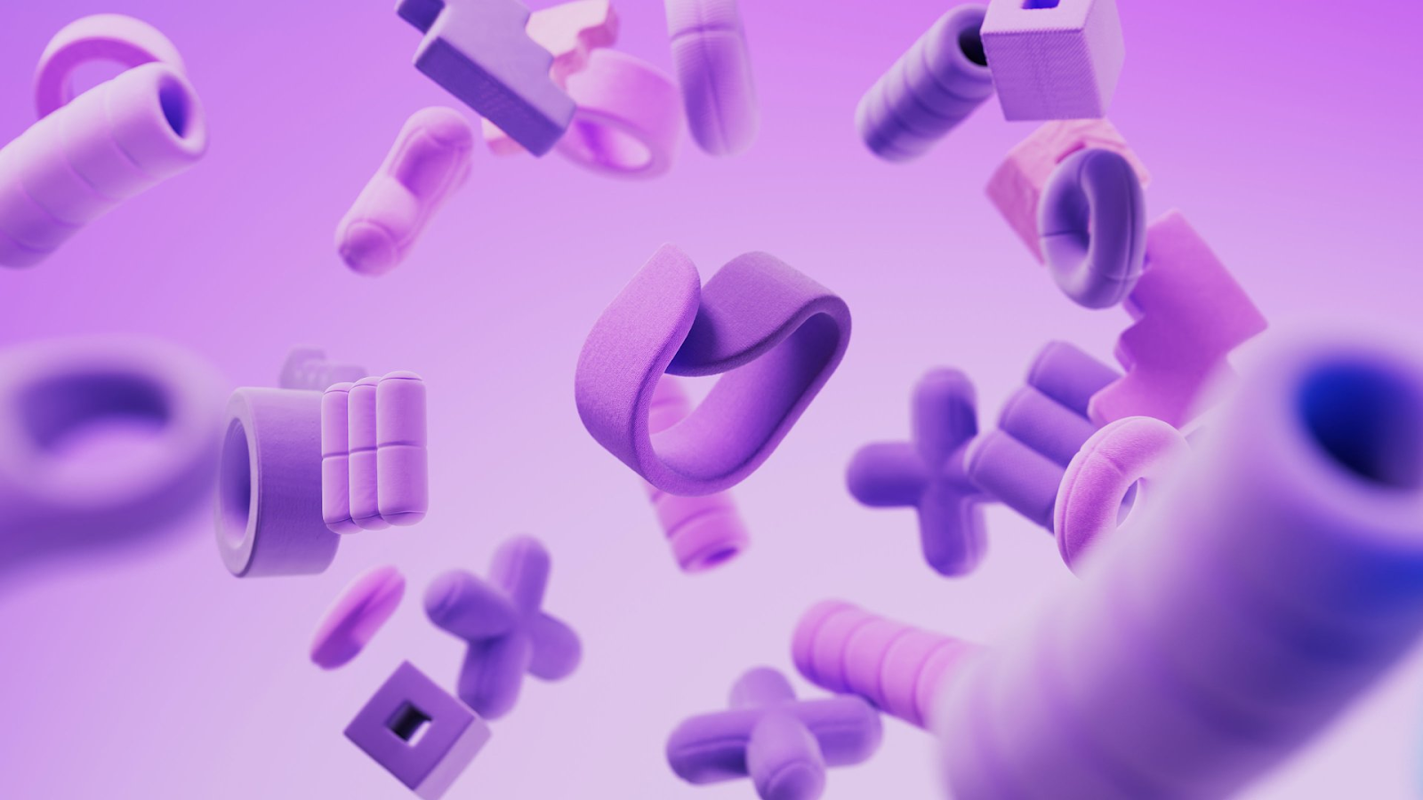
Some may see this as an indication of the death of flat (seeing as many typically follow suit from Apple).
As we approach a more augmented future, considering how design elements interact with real life is becoming more important. Flat design would feel disjointed in an AR scenario, so translucency is key.
Shortly after the first draft of this article, Meta announced their latest update to their Ray-Ban AR glasses. The new update hosts a mini display, touting a glass-like UI, a perfect example of why this style of design may become a necessity as we move forward.
We’d also argue that the rise in robotic AI increases the need for these kinds of companies to feel more friendly and approachable, more ‘human’, if you will.
Whatever the future holds, we’re excited for it, having recently bolstered our 3D capabilities and working on several projects in this space.
However, we don’t believe flat design will die out; there’s something about how bold and punchy this can look that will always have a place in branding and design.
Studio Updates
This month, we’re excited to welcome another new member to the team, Stefano Malerba.
Stefano is from Italy and has been in the motion game for over 10 years. His skillset expands across both 2D and 3D, as well as art direction.
In his spare time, Stefano runs an educational program called School of Design, where he helps teach graphic and motion design to budding students in Italy.
We’re over the moon to have him on board and excited to see how he levels up our projects.
We’re working on a rebrand film for a very exciting brand; however, it is unfortunately under very strict NDA, so you may not see this one until 2026…
We’re also working again with our partners at COLLAB, helping create a series of event visuals for the upcoming Beverage Forum in October in London.
This project has involved a combination of 2D, 3D, illustration, and AI, so make sure to keep your eyes open for the full case study.
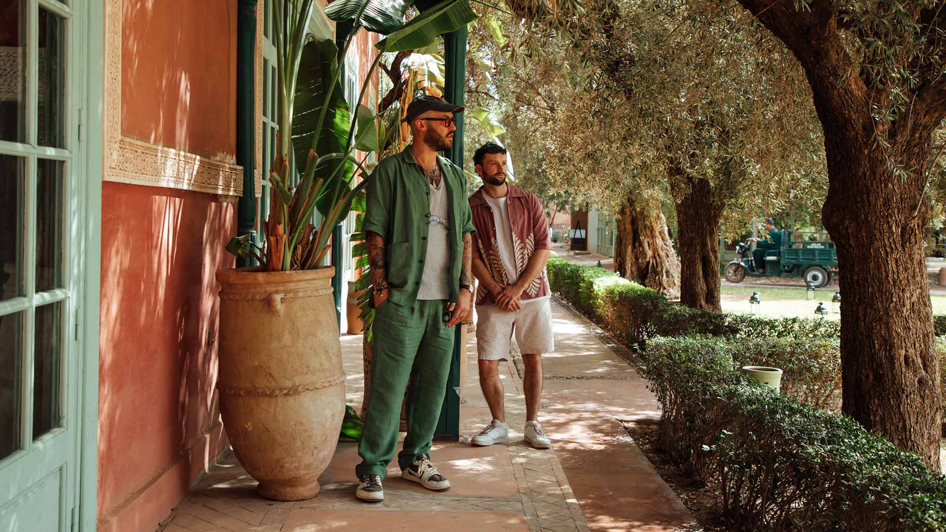
Jack and Jimmy had some more travelling this year, with the two flying out to Marrakech for Paradigms. The vibes were seriously on point this year, and the Frontify team did an amazing job, as always.
Looking ahead, the two will also be at We Are Playground’s In Motion event in London - if you’re around, make sure to come say hi!
How Taxi Studio Use Motion to Build Cultural Brand Worlds | Months in Motion
How do you design a brand that moves with culture?
In this episode of Months in Motion, Jimmy Gordon sits down with Stu Tallis, Creative Director at Taxi Studio, to unpack the motion strategy behind FlowFest - the world’s biggest reggaeton festival — and how motion design brings brands to life emotionally, rhythmically, and globally.
Stu shares behind-the-scenes insights from work on Coca-Cola, YOLOH insurance, and his thoughts on what today’s brands are getting wrong about visual identity systems.
Too Gallus on Boutique Studios, Culture & Breaking the Big Agency Model
What does it mean to run a studio that feels like a person - not a product?
In this episode of Months in Motion, Jimmy Gordon chats with Barrington Reeves, founder of Too Gallus, one of the UK’s most distinctive boutique studios.
From working with Nike and Red Bull to building a Glasgow creative family, Baz shares how attitude, culture, and truth-telling turned Too Gallus into a brand of its own.
It’s raw, honest, and full of laughs - a must-watch for anyone building a brand, a business, or both.
Interested in working with us? We’ve still got some availability for Q4, drop us a line hello@oksocial.co.uk

